Sunday, June 8, 2014

Mixed Media Project


                                                        Mixed Media Project - The Lost Fairy
Tissue paper, water color paint, acrylic paint, chalk pastels, glitter, colored pencil, and charcoal
Painting the hook
Adding the fairy and the eye
Final

            Did you use a source for inspiration, then combine it with your own ideas to make it original?
The source I used for inspiration was from Disney's adaption of Peter Pan. I decided to change it up completely and added a different twist to it. In the movie, Tinkerbell had blonde hair, a small green dress, and was captured by Captain Hook. (I am going to go into full details later about why I painted a faded hook and a feminine eye.) I Google imaged some pictures of human eyes and fairies. I changed up the colors and mix and matched hair styles for the fairy.
           Did you learn new techniques or processes as part of the work for this project?
A new technique that I learned to use was tissue paper. Although we used it once at the way beginning of the semester, I finally grasped a fuller understanding of it. I mixed two different colors together, such as yellow and green, to represent the original Tinkerbell colors. I also learned in the other mixed media project that we did was that you can crumple the tissue paper up, wet it, and let it dry crumpled onto the paper. It creates a cool texture and variety to your artwork.
            What is this artwork intended to say?
First I'm going to explain the symbolism in my composition. Like I said earlier, I decided to make the table yellow and green to represent Tinkerbell's original colors. I painted my version of Tinkerbell trapped in a jar just like she was captured by Captain Hook. This time she is captured by a girl, hence the feminine looking eye. I decided to paint a faded Hook to show that this scene reminds the fairy of her previous experiences with being captivated.  The little box with glowing pieces of coins represents Captain Hooks love for treasure since he was a pirate.
Sometimes I feel as if I am the fairy in the situation. I feel like I'm trapped inside a jar with someone controlling me, and I need to be freed. 
             Did you try something that you weren’t sure about as part of this project?
I wasn't sure about how I was going to make the hook fade into the background or the eye blend in with everything. The acrylic paint was hard to cover up with tissue paper and water color. I then realized that the chalk pastel can make anything look blurry, so I colored over the hook. I felt like the hook was well faded into the background. I didn't want it to fade so that it wasn't able to be seen. I also wasn't sure about what to do with a random eye floating in the sky. So then I took my chalk pastel that matched as close to the paint as possible and colored in the background.
           Did you ask another student for feedback during your work process?
I asked one of my classmates a few questions during this project. I asked her how I could fade the hook into the background, but she didn't have an answer for that. I also asked her how I could make the eyelashes skinny and not incredibly think. She said that I could use my charcoal pencil to draw some of the lashes. It worked; it made some of the lashes skinny and realistic looking. Lastly, I asked her if I should paint the face or just cover it up with glitter, since she is a fairy, and she liked the glitter idea.
           How did you respond to challenges that occurred as you worked?
I didn't really come up with many challenges, as this project was a breeze for me. The only big challenge that I had to face was time. We only had a week to work on this project, and I usually take eight hours on each project. I was absent one of the days so I had to take it home and work on it. That was one of the main difficulties I had to go through. 
           Did you consider how ideas would work before you tried them?
All of my thumbnails for this project were the same things but I placed each object in different places. I also positioned the fairy differently in every thumbnail to see which one I liked best. I had some where she was touching the glass or tapping on it trying to get out. I also had some where she was sitting up against the glass worried. I finally came to the conclusion that I actually liked her huddled in a ball confused and scared. I also planned out where I would place the hook. At first it was just going to be the fairy and the hook, but then I wanted to change the story completely. I decided to add the eye to say that she was captured again but by a little girl.
          Did you find inspiration from another artist or culture?
I found inspiration for the story of my artwork from the movie Peter Pan. I then found more images that inspired me for what eye color I should paint, or what the fairy should look like. Every picture of a fairy looked completely unique. They all had different hair styles, hair colors, faces, skin colors, dress types, and even dress colors. Every fairy had a different set of wings. Some of the fairies glowed or sparkled, and some of them didn't. I mixed a lot of the different sources that I found and put them all together.

Thursday, May 8, 2014

Strawberry Chocolate Fondue Acrylic Painting


                                                           Acrylic Painting - Strawberry Fondue

                                         
                                                                        Thumbnail
                                                                          Final Sketch
Painting in progress
Painting in progress...
Final Painting


Did you use a source for inspiration, then combine it with your own ideas to make it original?
I did use a source for inspiration; I searched for many pictures of strawberries and strawberries dipped in trouble. I then searched for images of chocolate dripping to get a feel for what it should look like, and then I incorporated it into the painting.
 Did you gain skill with familiar materials?
I don't feel like I gained much skill with using the acrylic paint because I use acrylic paint every time I do a painting. The only skill I think I strengthened was turning a flat image into looking 3-d. I did have to go back in and highlight certain areas on the leaves, darken the shadows of the leaves, and lighten the chocolate.
How is this artwork about who you are or what you like?
This piece of artwork doesn't really show much about who I am, except for the fact that I like strawberries dipped in chocolate. I am a big fan of chocolate.
Did you try something that you weren’t sure about as part of this project?
The chocolate drippings on the top of the painting were something I was really skeptical about painting. I wasn't sure about how it turned out because when I first started painting it, it looked like a mess. I'm not really happy with how it turned out; I think the painting would have looked much better without the chocoalte on the wall.

Did someone help you understand important information or inspire you? 
I was having difficulties with this project looking two dimensional, so I constantly asked Miss. Rossi for ideas and ways I could make the strawberry and chocolate look realistic. She helped me keep the chocolate from looking like one plain dark color, and helped me add life to the leaves by telling me to add light greens.
Did your work take an unexpected turn due to a mistake or did something happen that was unplanned?
I made a huge mistake, as I said before, with the chocolate dripping from the wall. It looks like a huge mess and it doesn't look like chocolate at all. I tried to fix it the best I can because it looked even worse before hand. I really hope that it doesn't drag the attention away from the strawberry. I think that the chocolate drippings could do the painting more justice if they weren't there.
                         Did you consider how ideas would work before you tried them?
I planned out the strawberry in my final sketch and I colored in where I would have my shadows and lights. When I was going to add the chocolate drippings I drew them lightly in my sketch, which wasn't the smartest thing to do. I should have planned it better, so I suffered the consequence of it looking terrible.
                                                Did you use technology as a tool?
I used the internet as a search tool for finding my pictures. I did not take any of the pictures I used as references. Thanks to Google I was able to create my painting. I also used paintbrushes and an art easel, but I'm not so sure that that's classified as technology.

Tuesday, March 25, 2014

Up Close and Personal - Chalk Medium


                                                  Up Close and Personal - Chalk Medium
                                                                 The Dragon's Eye

                                                                         
                                                                            Thumbnail
                                                         
                                               
                                                                        Final Sketch

Final product with chalk

How did you respond to challenges that occurred as you worked? 
One of the main challenges I ran into using this medium was over blending. Dragon's usually have scaly textures and I first didn't have the cracks showing. I went back in and outlined the scales in black. Another challenge I went through was not being able to get dark. I had to do many layers of black and color to finally reach the medium I wanted. The last thing that I had difficulty with was making things pop out. To fix this I used a whited to add highlights and used the black to deepen the colors. Overall using the chalk was very easy and I didn't come across any other problems.
Did your work take an unexpected turn due to a mistake or did something happen that was unplanned?
     My work went as planned as far as I can think of. The only thing I didn't expect was the flatness in the eyeball. I thought it was going to end p more rounded and three dimensional, but most of it ended up being flat.

What is this artwork intended to say?
My drawing of the dragon eye shows evil, darkness, and hatred. It represents negativity and dark times up close in action. This dragon is awake and it has evil written all over it. There are so many things that the darkness of this dragon can represent. It is there for the viewer to interpret.
What issues are you examining through your artwork?
Negativity is a common occurrence in many people's minds. Negativity sees everything and manages to get in the way of many things. The dragon eye shows that it has a view of everything and the dragon gets in the way and blows fire, just like negativity can show up at any moment. 
How is this artwork about who you are or what you like?
I personally can't stand constant negativity, but the dragon eye shows that there is darkness and negativity everywhere. I also find dragons very interesting and I am a huge fan of drawing eyes. I know drawing eyes is a popular object to draw, but I wanted to try something different and draw a non human eye.

Did you learn new techniques or processes as part of the work for this project?
I learned the technique of starting off in light layers and then build up the intensity. Usually when I used color I start off very dark and then it makes it difficult to blend. Using this technique helped me build depth in the dragon eye and it's skin.
Did you gain skill with familiar materials?
As I continued drawing with the pastels, I became more comfortable with the materials and it was much easier to work with. I am looking forward to using this medium again because I am now experienced with using the color chalk pastels.   

Color Mediums


                                                               Medium Drawings

                   
                                                                             Oil Pastel
                The oil pastel medium was very fun to use, but I found it quite difficult to blend with. When I started this drawing I began at the top of the can with the soda tab. I found this easy to draw and blend, but then I proceeded to draw the rest of the can. As I was coloring the edges with a dark blue and black I realized that it would not blend the way I wanted to. I left that alone and drew the words Coca Cola and I feel confident about those. I used white to help highlight each letter. I then went back to the rest of the can and I found that I was going dark really quickly. Using oil pastels was a challenge for me and I couldn't get it to blend smoothly. I did enjoy using them because the colors were very vibrant and I liked the consistency of the medium.
                                                             
                                                                     Colored Pencils
                    The colored pencils was the most challenging medium for me to use. I found that my lollipop drawing turned out very patchy and rough. I think the best part of the drawing was the lollipop stick because I was able to blend it and I felt good about the shading. If I were ever to use colored pencils again I would most definitely practice with the blending so the shadows don't look so patchy. I have used Prisma Color pencils before and I found them easy to work with, but using only a white Prisma Color and the rest Crayola was very difficult. They did not work well and I feel if I used all Prisma Color my drawing would have blending better and not look streaky.      
                                                                     Chalk Pastels
                  The chalk pastels medium was the easiest medium for me to use. I enjoyed how soft the pastels were and how they glided on the paper. They were fairly easy to blend with and transition into other colors. The sphere shaped candy was easy to draw with the chalk pastels because of the smoothness of the medium. The only difficult part of the drawing was the wrapper. I had too many white lines popping out of nowhere; they didn't connect to anything. I then switched to the chalk stick instead of the chalk pencils and I then could get the hang of drawing the wrapper. This is the color medium drawing I'm most proud of because of the smoothness.

Sunday, March 2, 2014

Scientific and Contrast Drawing


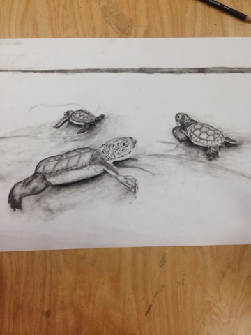
This is a photo of my work in progress. It does not contain the other turtle and the sand isn't drawn yet. 


1.  To portray the theme of Scientific, I had a few mini themes scattered throughout my project. Life and birth can be thought of as scientific. The turtles in my composition represent this mini theme. The scenario also shows the mini theme 'land versus sea'. The turtles are making their way towards the sea from being hatched. 
2. The mini lessons were not very beneficial to my project because I already was familiar with using charcoal. I have used charcoal to do portraits of people. I did enjoy drawing the sphere and paper bag though. I love drawing detail and that is a key factor when drawing realistic items with charcoal. 
3. I showed contrast in my work with the charcoal on white paper. I also used one of the mini themes, 'land versus sea', to show contrast in the scenery. 
4. I decided to use the charcoal pencils for my composition. I felt most comfortable with using these since I have worked with them on various drawings. I don't like using graphite pencils because they give off a shine on the drawing and it makes it seem realistic. The charcoal has a matte finish to it. Charcoal is easier to work with in my opinion because it blends very smoothly. I do not enjoy pen and ink. I used pen and ink for a project in 8th grade and I haven't mastered the skills for it yet. 
5. Some techniques I used for my composition were shading and blending. These two important techniques help create a realistic feel to the drawing and give it shape and definition.
6. I did not take any risks in this project because I do not enjoy the other mediums. I would not want to spend my time on a project that I didn't want to take part of because I didn't like it. I have used all of the methods in other drawings and charcoal is the one I perfer the most. Also, since I am being graded on how the drawing turned out I would want myself to feel proud of it. 
7. This project was enjoyable because I did get to use charcoal, but it did become tiring after a while. I got bored drawing more than one turtle. I enjoyed drawing the first one and it had a lot of details, but the more I drew these animals the more I got bored with it. I did enjoy shading, that has to be my favorite part of drawing.  I love making things look as realistic as possible.